The paradigm shift that has been taking place in the automotive industry for over a century is changing the way we look at cars and brands, even those that choose not to neglect the development of models with combustion engines. There is no strategy that does not currently involve a strong commitment to electric technology and digitalization, and the way secular companies find to convey the message also includes a new visual identity for the new era of sustainable mobility accessible to all.
Part of these new brand strategies are based on creating a more modern and authentic look that also reflects the company’s new ambition for the future. Starting with the badges.
Dacia Link
Dacia Link is the new symbol of the Romanian brand of the Renault Group. The logo symmetrically combines the initials ‘D’ and ‘C’ in a mirror image, symbolizing the trust between Dacia and its customers (hence the name). It was created internally by Dacia’s design team to express the essence of the brand, the idea of simplicity combines with the robustness offered by the union of those two letters, and without a background to convey the message of a brand that focuses only on what is essential.
KIA
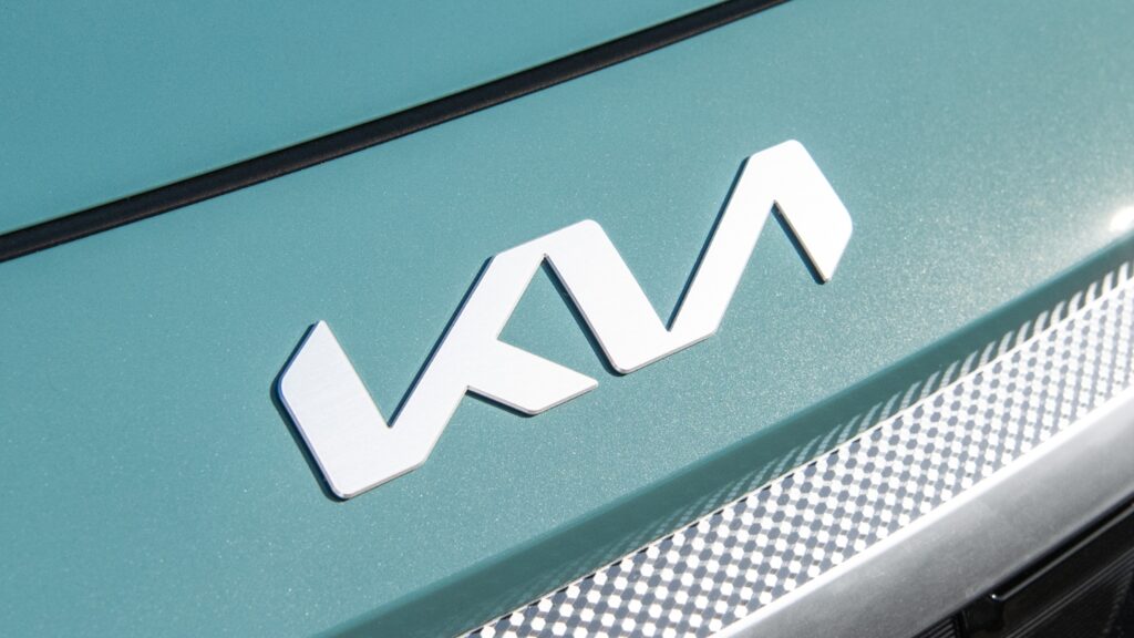
Kia first changed the brand slogan, which was “The Power to Surprise,” and started using “Movement that inspires.” Along with this change, a new corporate logo was introduced on the front of all new Kia models. According to the brand’s president, Ho-Sung Song, “the new logo reflects the desire to inspire customers as their mobility needs evolve.” However, the new emblem, designed to incorporate the values of symmetry, rhythm, and growth desired by the company, was not understood by everyone in the same way… According to data from Google search engines, in the first months of its commercialization, the logo misled thousands of people, and more than 30,000 searched online with the keywords “KN cars,” allegedly due to misreading the emblem of the new South Korean cars.
PEUGEOT
This hardly admits mistakes, but it did surprise some Peugeot fans by so visibly changing its presence on the front of the brand’s models, and by its retro inspiration. The new emblem is inspired by the one from 1960, which appeared prominently on the front section of the Peugeot 404. According to the manufacturer, “the lion symbolizes power, strength, and security, serving as an ambassador for our image and strength. Quality is always in the brand’s DNA. The logo itself was designed and developed internally with the same quality and attention that we dedicate to our models, with precision and care.” This is the 11th version of the emblem in over 170 years of history.

CITROËN
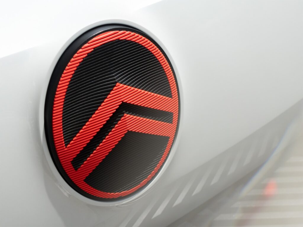
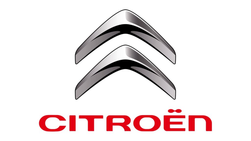
Another brand that looks to the past to move forward, Citroën also presented a simplified version of its emblem, the famous double-chevron. The central elements now appear positioned inside an oval emblem that refers to the original 1919 logo. This is the 10th evolution of the Citroën emblem in 104 years of history.
OPEL
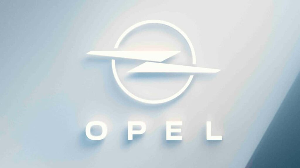
For the new era of electrification, Opel has created a new motto: “The future is for everyone.” And a new logo has also been created to mark the change in strategy, with an image focused on what the brand considers essential in the new reality: “more clarity and simplicity.” The fundamental elements of the visual identity of the German brand’s emblem remain unchanged, with the circle symbolizing the wheel and the lightning bolt representing energy.
PORSCHE
The Porsche emblem will also change in the future, but only in the Turbo versions, marking the 50 years since the launch of the first turbocharged 911. “Since then, the Turbo has become synonymous with our top high-performance models, and it is now more or less its own brand. We want to make the Turbo even more visible and differentiate it more distinctly from other versions, such as the GTS,” explained Michael Mauer, Vice President for Porsche’s Style department. The exclusive version of the modernized Porsche crest debuts in a new color called Turbonite, a shade of gray instead of gold.

